
1. Demo Project
-
The Demo Project is for demonstration purposes only. It is for first-time users to understand how to use Diagram Master™.
-
The Demo Project has the same features as a Regular project. There are saved lighting diagrams in the Demo Project that allow you to demo features like scene, shooting schedule and fixture statistics, without creating a lighting diagram.
-
You can delete the Demo Project, however, you won't be able to restore the deleted Demo project unless you reinstall the app.
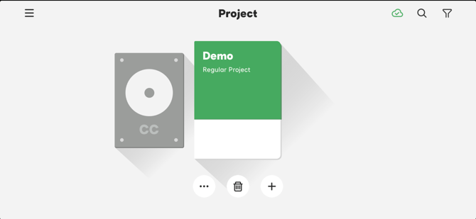
Figure 1-1 Demo Project
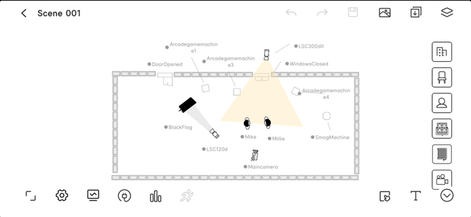
Figure 1-2 Lighting Diagram Scene in Demo Project
2. Project
The Project is the basic interface of Diagram Master™.
-
Projects are arranged by their shooting date, from newest to oldest.
-
Finished Projects will be reordered behind unfinished Projects automatically.
-
Finished Projects are arranged by their completion date, from newest to oldest.
2.1 Project Management
2.1.1 Create a New Project
-
In the Diagram Master™ main menu, tap the "+" button, then select a project type: Regular Project or Agile Project.
-
Fill in the project information, or skip, to create a new project.
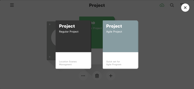
Figure 2.1.1 Create a New Project
2.1.2 Delete a Project
-
In the Diagram Master™ main menu, select a project, then tap the delete button
 to delete.
 -
A deleted project cannot be restored.
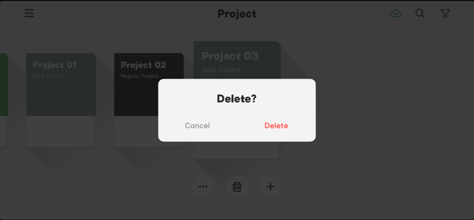
Figure 2.1.2 Delete a Project
2.1.3 Manage Project Information
-
Enter the Diagram Master™ main menu, select a project, then tap the
 button to manage settings information.
 -
In the project management menu, you can mark the project as completed, enable collaboration and customize the cover color.
- Project Info: Tap the "Edit" button in the upper-right corner to edit the project name, project beginning/ending dates and information about the project producer, director, director of photography, gaffer and project type.
- Mark as Completed: Mark the project as completed and the label of "Finished" will be displayed on the cover to distinguish it from projects that are in progress.
- Enable Collaboration: Share projects to a collaboration group for your team members to view.
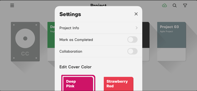
Figure 2.1.3-1 Project Management Menu
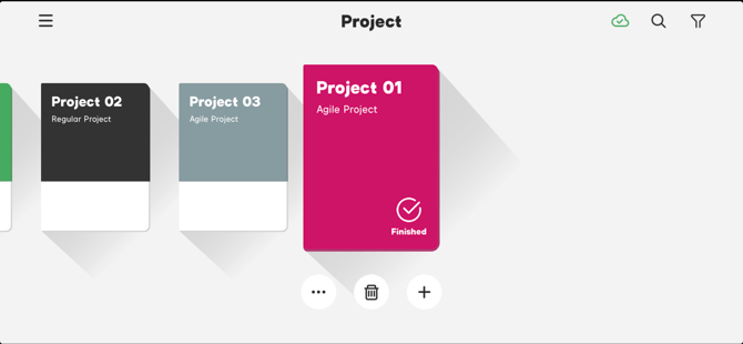
Figure 2.1.3-2 Finished Project Label
2.2 Regular Project
You can create up to 20 script rolls in a Regular Project and up to 20 scenes in a single script roll.
- Create a new Script Roll: After entering the Script Roll, tap the "+" button, then select a scene number range in the pop-up menu. The Script Roll's will display in the order that they were created, from newest to oldest.
- Delete a Script Roll: Select a script roll, select a scene, then tap the delete button to delete the scene. You cannot restore the scene after deletion.
- Modify Script Roll Information: Select a script roll, select the scene, then tap the button to change the scene name or mark the scene as complete.
- The scene will be marked "Finished" on the cover. The finished script rolls will be arranged in the order that they were created, from newest to oldest.
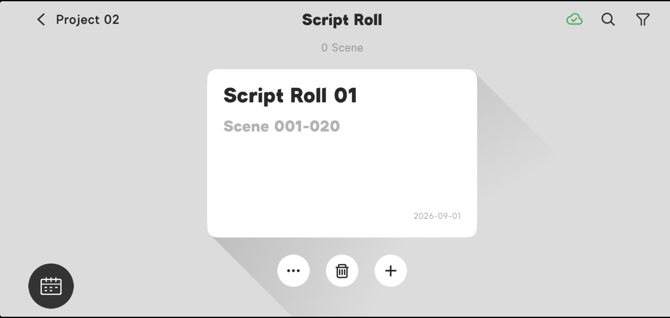
Figure 2.2-1 Regular Project Script Roll
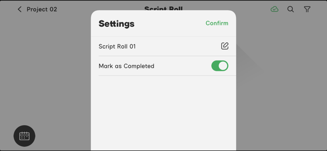
Figure 2.2-2 Regular Project Script Roll Settings
2.3 Shooting Schedule
-
In a Regular Project, tap the Calendar button
 in the lower-left corner to enter the Shooting Schedule.
 -
You can insert a saved lighting diagram into the shooting schedule. Shooting Schedules will be arranged in the order that they were created, from newest to oldest.
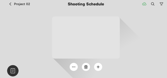
Figure 2.3 Shooting Schedule Menu
2.3.1 Create a Shooting Schedule
-
Open the Shooting Schedule, then tap the "+" button.
-
Fill in the information in the pop-up menu, or tap "skip", to create a new Shoot Day.
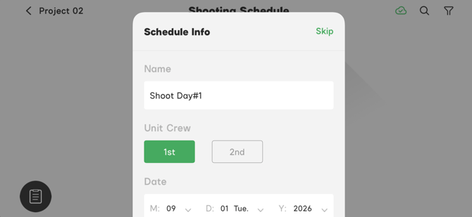
Figure 2.3.1 Create a Shooting Schedule
2.3.2 Create New Shoot Days
-
After creating a new shooting schedule, the scene selection page will pop up.
-
Tap a script roll on the left side of the page to display the saved scenes.
-
Select a scene and it will light up and appear green.
-
Tap the "Done" button to insert the selected scenes and create a new Shoot Day.
-
Tap the switch icon in the upper-right corner of the scene to preview the scene. You can select multiple scenes and insert them all at once.
-
You can add more scenes via the Shoot days settings menu. Shooting schedules will be arranged by the order of the shooting time, from newest to oldest.
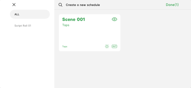
Figure 2.3.2 Select Scenes to Create a New Schedule
2.3.3 Delete a Shoot Day
Open the Shooting Schedule, select a Shoot Day then tap the delete button to delete it. The Shoot Day cannot be restored after it is deleted.
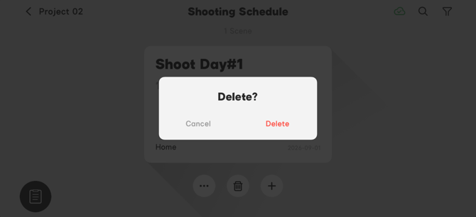
Figure 2.3.3 Delete a Shoot Day
2.3.4 Manage the Shooting Schedule Settings
- Open the Shooting Schedule, select the Shoot Day, then tap the button to manage the Shoot Day settings.
- In the Shoot Day settings menu, you can modify Schedule Info, manage scenes and mark the Shoot Day completed.
- Shoot Day Info: Tap the "Edit" button in the upper-right corner to edit the Shoot Day name, unit crew, date, location and notes.
- Scenes Management: You can add more scenes in the scenes management menu.
- Mark as Completed: Mark the Shoot Day as completed. The Shoot Day cover will say "Finished". The finished shooting schedules will be arranged by the order of the shooting date, from newest to oldest.
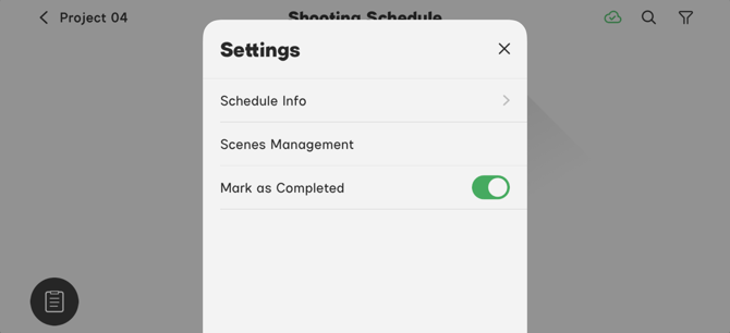
Figure 2.3.4-1 Shoot Day Management Menu
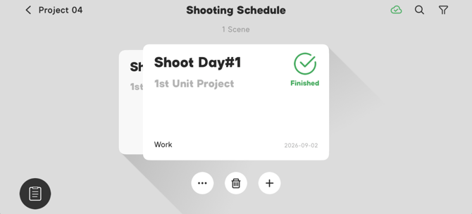
Figure 2.3.4-2 Finished Shoot Day
2.4 Agile Project
Agile Projects do not have the Shooting Schedule feature. You can create up to 20 rolls in an Agile Project and up to 20 scenes in a single roll.
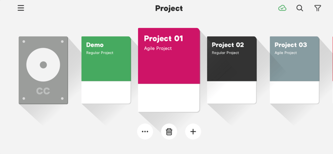
Figure 2.4 Agile Project
2.4.1 Create a new Roll in an Agile Project
In an Agile Project, tap the "+" button to create a new Roll. Roll's will be arranged by the order of the date the were created, from newest to oldest.
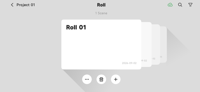
Figure 2.4.1 Create New Roll in an Agile Project
2.4.2 Delete a Roll in an Agile Project
In an Agile Project, select the Roll, then tap the delete button to delete the Roll. You cannot restore the Roll after deletion.
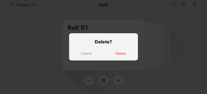
Figure 2.4.2 Delete the Roll
2.4.3 Manage Roll Settings
In an Agile Project, select the Roll that needs to be modified, then tap the button to modify the Roll's name or mark the Roll as complete. "Finished" will be displayed on the cover. The finished Rolls will be arranged by the order of the created date, from newest to oldest.
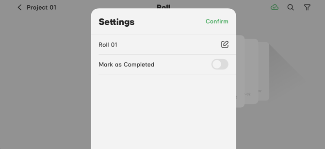
Figure 2.4.3-1 Roll Settings Management Menu
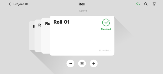
Figure 2.4.3-2 Finished Roll
2.5 Search and Filter
2.5.1 Search and Filter for Projects
On the Project page, the  Search and
  Filter buttons are in the upper-right corner. Search by project name or crew name. In the Filter menu, users can find the project by selecting Project types, Project creation date and Project Status.
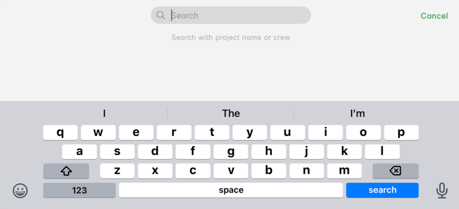
Figure 2.5.1-1 Search for a Project
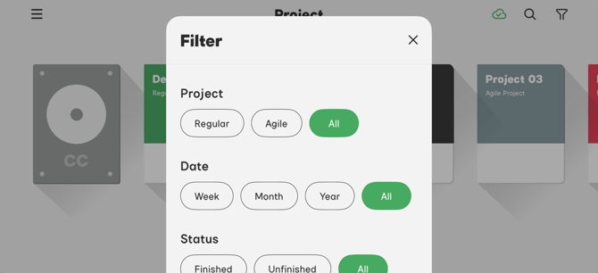
Figure 2.5.1-2 Filter Projects
2.5.2 Search and Filter for Script Roll/Roll
On the Script Roll/Roll page, the Search and Filter buttons are in the upper-right corner. Search by scene name, scene number or location. In the Filter menu, you can find the project by selecting Script Roll/Roll creation date or Script Roll/Roll Status.
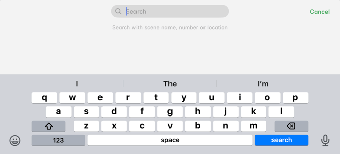
Figure 2.5.2-1 Search for a Script Roll/Roll
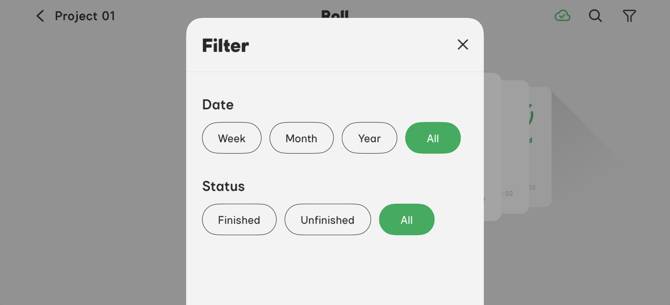
Figure 2.5.2-2 Filter Script Roll/Roll's
2.5.3 Search and Filter for the Shooting Schedule
On the Shooting Schedule page, the Search and Filter buttons are in the upper-right corner. Search by scene name, scene number or location. In the Filter menu, you can find a project by selecting different Shoot Day creation dates, Shoot day Status or Unit Crew.
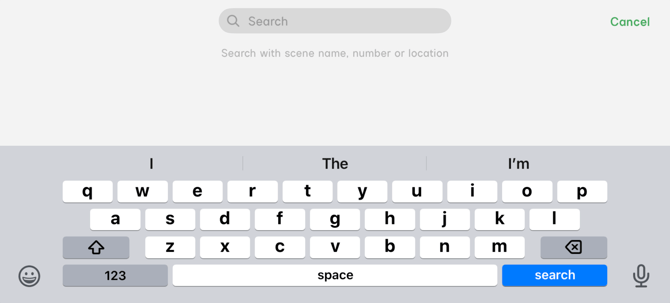
Figure 2.5.3-1 Search for a Shooting Schedule
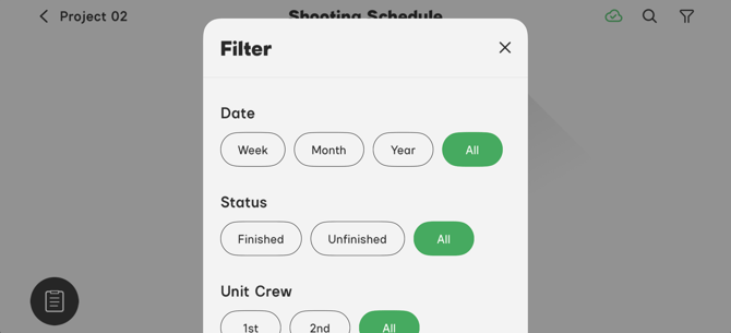
Figure 2.5.3-2 Filter for Shooting Schedule
2.5.4 Search and Filter for CC Group
On the CC Group page, the Search and Filter buttons are in the upper-right corner. Search by Project name or crew. In the Filter menu, you can find the collaborated project by selecting different Project types, Project collaboration dates and Project Status.
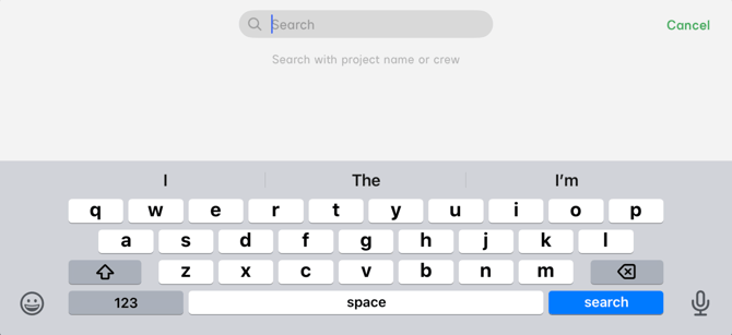
Figure 2.5.4-1 Search for a CC Group
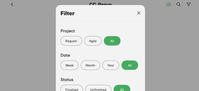
Figure 2.5.4-2 Filter CC Groups
2.6 Sidus Cloud Service Online Icon
Except for in the editing interface, the Cloud service icon is on the upper right corner of the interface.
- When the Cloud service icon turns
 green, the current device is online and the Cloud service will save the lighting diagram in the cloud. You can share lighting diagrams when the device is online.
 - When the Cloud service icon turns
 grey, the current device is offline and the Cloud service will not save the lighting diagram to the cloud. You cannot share lighting diagrams when the device is offline.
3. Scene Editing Interface
The Regular Project and the Agile Project use the same scene editing interface. Open a Script Roll/Roll, then tap the scene to enter the scene editing interface. You can build your scene with production elements. The app will record the added fixtures, modifiers and power load.
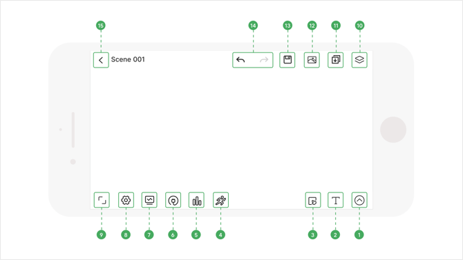
Figure 3.Scene Editing Interface
- 1) Icon Toolbar
- 2) Text
- 3) Box Selection
- 4) Rehearsal Tool
- 5) Fixture Statistic Tool
- 6) Power Statistic Tool
- 7) Monitor
- 8) Settings
- 9) Full-screen
- 10) Scene Management
- 11) Insert
- 12) Background image
- 13) Save
- 14) Redo/Undo
- 15) Return to the Script Roll/Roll
3.1 Icon Toolbar and Fine Adjustment Tool
The Icon and the Fine Adjustment tools are located in the lower-right corner of the scene editing interface. Tap  to open the icon toolbar. You can select from different icon categories. Add an icon to the scene, then use the fine adjustment tool
  to dial in the placement of the icon.
3.1.1 Add Icon
-
Open the icon toolbar, enter the icon category, then tap an icon.
-
The screen will return to the editing interface. Tap the anywhere in the scene and the icon will be added to that location.
-
Tap the added icon and the icon turns green. Hold to move the icon or use the fine adjustment tool to move the icon.
-
Long-press the icon to add details to the icon in the pop-out menu. See details at 3.2 Icon Marking for more information.
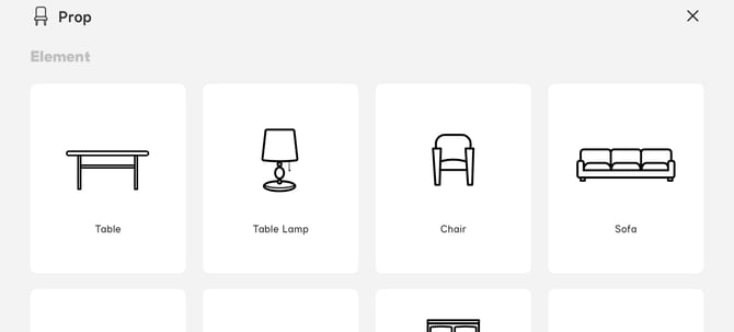
Figure 3.1.1 Scene Icons
3.1.2 Icon Categories
-
The Icon categories are Scene, Prop, Character, Lighting, Modifier and Camera.
-
The Lighting category contains amaran, Aputure, ARRI, ASTERA, KINO FLO, Litepanels, Mole Richardson and General Lighting lists.
-
The Modifier category contains Diffusion, Cutters & Patterns, Spots & Bounces & Reflectors and Others lists.
3.1.3 Fine Adjustment tool
-
Select an icon and the fine adjustment tool will appear on the plot.
-
Long press the fine adjustment tool to drag it to a different position on the plot.
-
The fine adjustment tool is divided into two modes: fine adjustment position and fine adjustment angle. You can switch between these two modes by tapping the center part of the button. The default mode is fine adjust position.
-
Tap the fine adjustment tool to adjust the position of the icon.
-
In the fine adjustment angle mode, tap the fine adjustment tool to adjust the angle of the icon. Each time you tap the button, the adjustment angle is 5°.
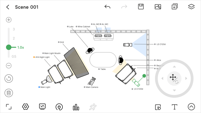 Figure 3.1.3 Fine Adjustment Tool
3.1.4 Icon Orientation Adjustment
Select an icon, then hold the solid green circle to adjust the icon's orientation.
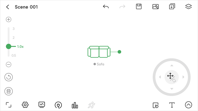 Figure 3.1.4 Green Icon Orientation Circle
3.1.5 Box Selection Function
The Box Selection icon function is on the bottom-right corner of the scene editing interface.
-
Tap the
 button to enter box selection mode, then click the icon again to exit box selection mode.
- Drag the box on the diagram to select the icons in the box. Tap a blank area outside of the box to cancel the selection. Tap multiple icons, then cancel the selections by tapping them again.
- Hold the box and drag to move all selected icons in the box.
- All of the icons have layer adjustment buttons. Tap the
 button to bring an icon to the top and tap the
  button to send it to the bottom.
 - When icons occupy the same location in the diagram, use the layer adjustment buttons to modify their layer orders.
- The Scale-up/down slider
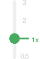 is a general button for many icons. Select an icon and the slider will appear on the left side of the editing interface. Tap a blank area to hide the slider. The default icon size is 1x. The scale range is from 0.5x - 3x. The units on the slider are 0.5x, 1x, 2x and 3x. The fine adjustment units are ±0.1x.
 - The reset button
 located at the bottom of the slider is a general button for all icons. Tap the reset button to re-scale an icon to 1x.
 - To delete an icon, tap the
 button.
 - Tap
 to adjust the position and angle of the selected icons.
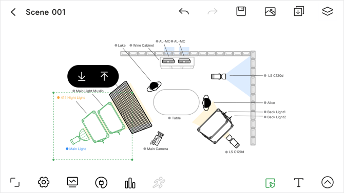
Figure 3.1.5 Box Selection
3.2 Icon Marking
Different types of icons have different marking lists.
- Tap the icon name to select it, then tap the view button
 to view the marked content.
 - Tap the edit button
 to edit the name, font size and color label of the marked content.
 - Long press the selected icon name to open the rename box. The icon name will be displayed together with the icon.
- The icon name can be moved independently.
- When the name and the icon exceed a certain distance from each other, there will be a thin line connecting the icon and the name.
- Color Tag: There are 7 color choices for color tags, which are red, orange, yellow, green, blue, purple and grey. After selecting a color tag, the dot ahead of the icon name and the icon name display the selected color.
- After adding a color tag, you can view the tagged icons in the monitor feature. Details see 3.5.2 Monitor.
- Special Reminder: When Special Reminder is enabled, there will be a red flag after the icon's name, which indicates that a special reminder exists.
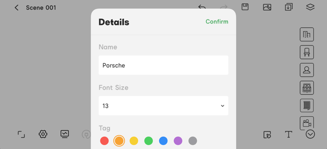
Figure 3.2-1 Icon Tag
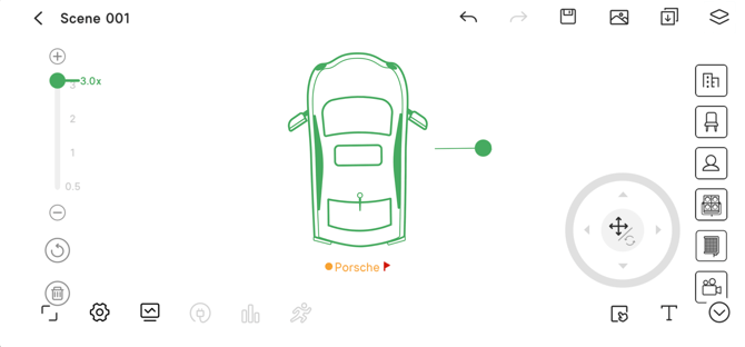
Figure 3.2-2 Special Reminder Flag
3.2.1 Scene Element Marking
- Tap to select an icon, then tap the icon again to open the marking menu. Tap the button to modify the icon name and add notes.
- Tap the button to delete the selected icon.
- Add the "Wall" icon, select the icon, then press and hold the
 to extend the length of the wall icon.
 - Tap to select the wall icon, tap again to open the wall icon marking menu. Tap the
 button to copy the wall icon. Tap the
  button to flip the icon, then input a value to rotate the wall icon. Tap the button to delete the selected wall icon.
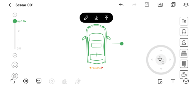
Figure 3.2.1-1 Tap to Open the Marking Menu
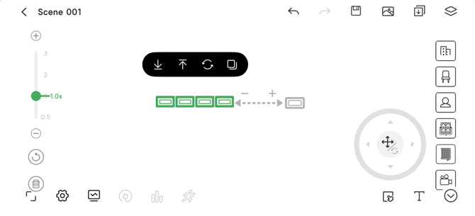
Figure 3.2.1-2 Tap the "Wall" Icon to Open the Marking Menu
3.2.2 Prop Element Marking
- Double-tap an existing prop element, then tap the
 button, then tap a blank area on the diagram to create a copy of that icon and a motion path line.
 - The motion path line is adjustable.
- You can add up to 9 levels of the motion path.
- After adding one copy, press and hold the copy to add another copy. Deleting an earlier copy will delete the copies after it.
- Tap the button to edit the details the icon.
- Tap the
 button, then input the number of copies to make of the selected icon.
 - You can make a maximum of 9 copies of an icon at once.
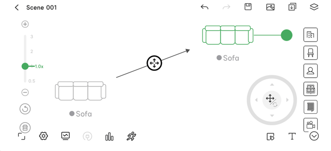
Figure 3.2.2 Motion Path
3.2.3 Character Element Marking
Select the added character icon, then tap to open the marking menu.
- Tap the
 button then, tap a blank area on the diagram to add a motion path line.
 - The motion path line is adjustable.
- You can add up to 9 levels to the motion path.
- After creating one copy, press and hold the copy to add another copy.
- If you delete one of the copies, the copy after it will be deleted as well.
- Tap the button to edit the name, cast number, motion and add notes for the icon.
- Tap the
 button, then input the number of copies to make of the selected icon.
 - You can make a maximum of 9 icon copies at once.
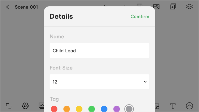 Figure 3.2.3 Character Elements Marking
3.2.4 Fixture Marking
Select the added fixture icon, then tap to open the marking menu.
3.2.4.1 Mark the Motion Path
-
Tap the
button then, tap a blank area on the diagram to add the motion path line. -
The motion path line is adjustable.
-
You can add up to 9 levels to the motion path.
-
After creating one copy, press and hold the copy to add another copy.
-
If you delete one of the copies, the copy after it will be deleted as well.
3.2.4.2 Mark the Fixture
Tap the button to edit the name, parameter and add notes for the fixture icon. In the parameter section, users can add information about Ground Clearance, Pitch Angle, Gel, CCT, Output and Illumination.
- Fixture ground clearance units are in m (meters) and ft (feet).
- Pitch angle can be ascending or descending.
- Gel information can be No Gel or select from the LEE® and ROSCO® professional gel lists.
- You can search for a gel with the gel name or number.
- The CCT marking range is from 1000K - 50000K.
- The output marking range is from 0% - 100%.
- Illumination units are lux, fc and f.
- You can add a note for the fixture.
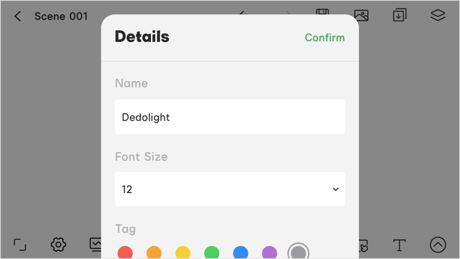 Figure 3.2.4.2 Marking a Fixture
3.2.4.3 Fixture Beam Marking
Tap the  button to adjust the fixture icon's Light Beam Angle and Source Color.
-
In the light beam menu, when the switch icon is shown as
 , the light beam is visible in the lighting plot.
 -
When the light switch icon is shown as
 , the light beam is not visible in the lighting plot.
- You can drag to adjust the light beam's projection area after setting the light beam to visible.
- When adjusting the lighting beam with the
 button, the pop-out window will show the beam angle in degrees..
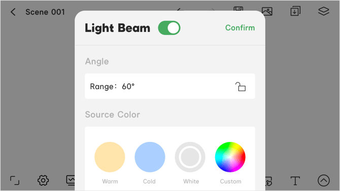 Figure 3.2.4.3 Light Beam Marking
3.2.4.4 Power and Rigging Marking
Tap the  to add power and rigging marking.
- Fixture power types are AC Power and Battery.
- The Statistic feature uses the power information and details to do a smart calculation. For more details check 3.4 Statistics and the Full-Screen Mode
- Add the Stands and Rigging information for the Statistic feature to process a list for the added stands & rigging.
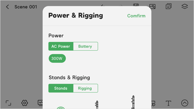
3.2.4.5 Fixture Accessories Marking
Tap the  button to add accessories to a fixture. Different fixtures have different accessories.
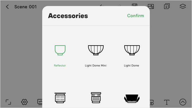 Figure 3.2.4.5-1 Add Accessories to a Fixture
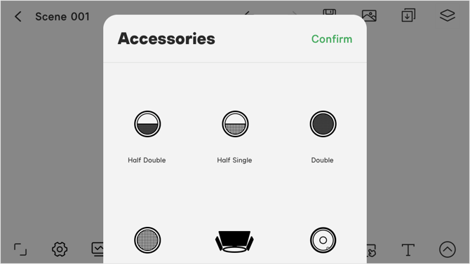 Figure 3.2.4.5-2 Add General Accessories to a Fixture
3.2.4.6 Fixture Icon Duplication
Tap the copy  button, then enter the amount of copies to make for the current icon. You can make a maximum of 9 copies at once.
3.2.6 Camera Marking
Tap the added camera icon, then tap it again to open the editing menu.
-
Tap the
 button, then click a blank area on the diagram to add a motion path line.
 -
The motion path line can be adjusted with the
button on the motion path line. -
You can add up to 9 levels to the motion path. After creating one copy, press and hold the copy to create another copy.
-
If you delete a copy, the copies after it will be deleted as well.
-
Tap the
button to edit the name, font size, color tag, parameters and add notes for the icon. -
In the Parameter section, you can set the resolution, frame, lens, focal length, aperture, white balance, ISO, shutter, ND, focus type, shot design, equipment and add a note.
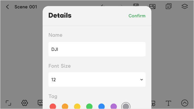 Figure 3.2.6 Camera Marking
3.3 Light Beam Adjustment
The light beam represents the light output status.
-
In the light beam menu, turn the Light Beam switch on to make the light beam visible in the lighting plot.
-
You can drag to adjust the light beam after setting it as visible.
-
When adjusting the lighting beam, the pop-up window will show the beam angle.
-
The angle units are in degrees. For more adjustments see the 3.2.4.3 Light beam marking.
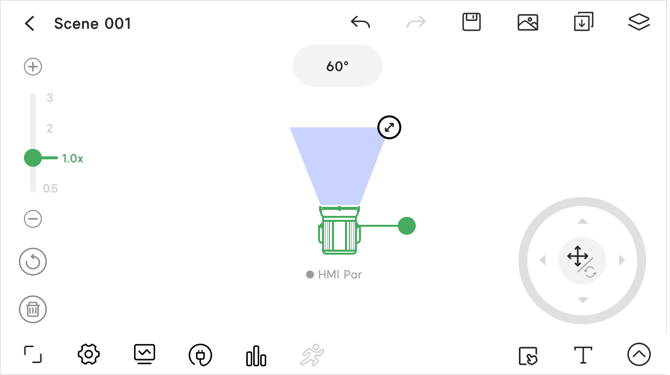 Figure 3.3 Light Beam Adjustment
3.4 Statistics and Full-Screen Mode
Statistics tools include the Power analysis tool and the Statistic tool. These tools can analyze the power draw of your rig and give individual fixture information as well.
3.4.1 Power
To use the power analysis feature, you need to add the power info when adding a fixture icon. For more information check the 3.2.4.4 Power and Rigging Marking.
-
The fixtures are organized by brand.
- Electric power: The default total power is shown as the Rated Load.
- Select Safe Load to check the recommended safe total power load.
- With battery: You can check the number of fixtures that use a battery or with a built-in battery.
- The battery types are divided into A-mount, V-mount and F-mount categories.
- You can also tap the plus
 button to add a custom battery type and quantity.
 - Tap the custom battery name to edit the name and the quantity.
- Tap the delete to delete the custom battery type.
- Battery Build-in: Add notes
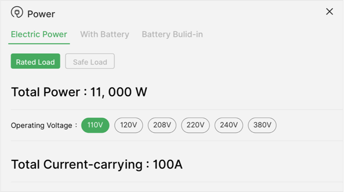 Figure 3.4.1-1 Electric Power
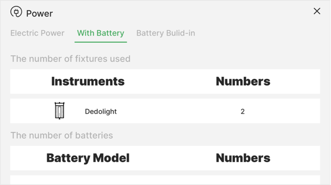 Figure 3.4.1-2 With Battery
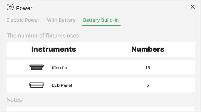 Figure 3.4.1-3 Battery Build-in
3.4.2 Fixture Statistics
To use the statistics feature, you need to add the statistics info when adding a fixture icon. For more information check 3.2.4.4 Power and Rigging Marking.
- Fixture: View the fixture quantity and add notes.
- Modifier: View the modifier quantity and add notes.
- Stands & Rigging: View the stands and rigging quantity and add notes.
- Camera: View the camera quantity and add notes.
- Property: View the property quantity and add notes.
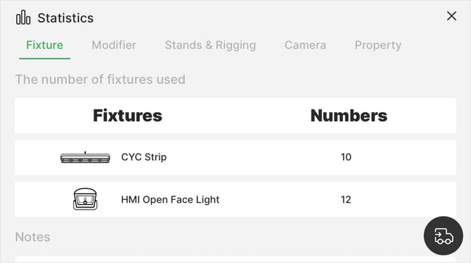
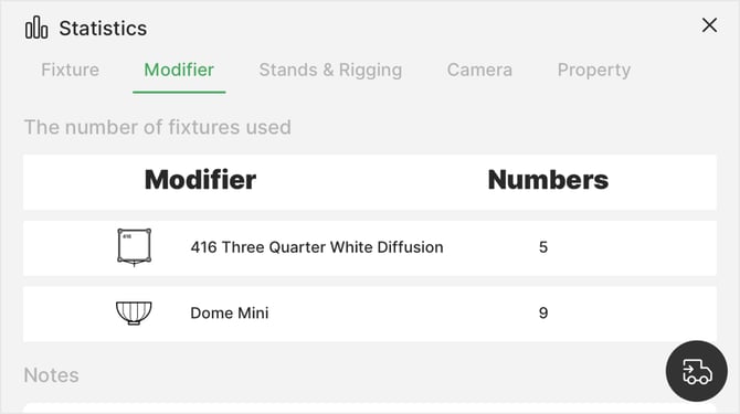
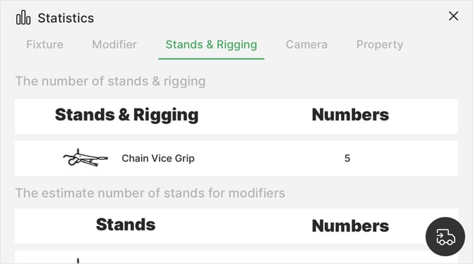 Feature 3.4.2-3 Stands & Rigging
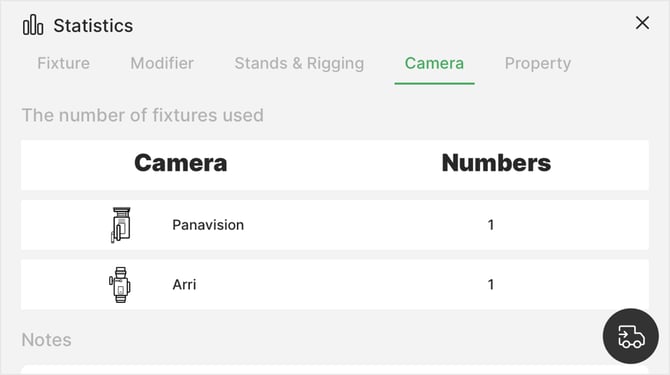 Figure 3.4.2-4 Cameras
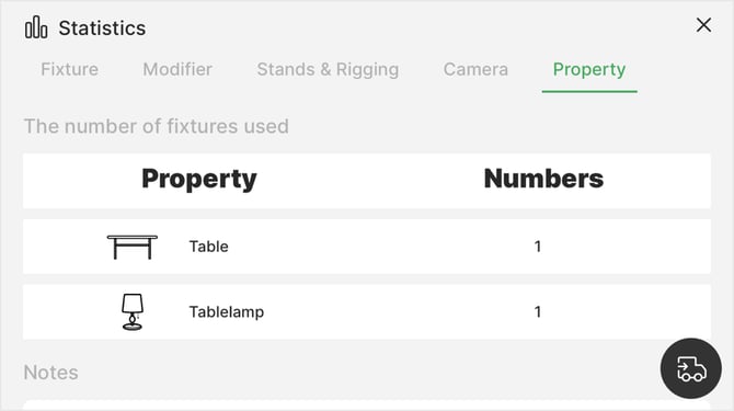 Figure 3.4.2-5 Property
3.4.3 Wrap-Up List
-
Use the Wrap-up list to organize a fixtures list.
-
Tap the Wrap-up list button
 on the Statistics screen to open the Wrap-up list. The Wrap-up process has five steps: Waiting for Load, Loading, Waiting for count, Counting and Finished.
 -
You can export a PDF file in each step.
3.4.3.1 New Wrap-Up List
- Open the Wrap-up list page and tap the plus mark on the left to start a new Wrap-up list.
- Enter the requested information or skip to enter the all fixtures list.
- Select the fixtures you'd like add to the Wrap-up list or tap Extra fixtures to add additional fixtures.
- Tap Confirm to create the Wrap-up list.
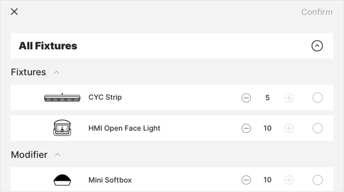
Figure 3.4.3.1 Start a New Wrap-up list
3.4.3.2 Load and Count
- Choose a Wrap-up list to enter the Waiting for Load page and select the fixtures to load.
- The list status on the top of the page will change to Loading when fixtures are added to the Waiting for Load list.
- When you have finished adding fixtures to the Loading list, tap the Wrap-up completed button at the bottom of the list and fill out the information in the pop-out window to continue.
- The list status will show that it is Waiting for count.
- Select the fixtures to count and the list status on the top of the page will display as Counting.
- When you are finished counting, tap the Count completed button at the bottom of the page and fill out the information in the pop-out window to complete the Wrap-up.
- The list status on the top of the page now displays as Finished.
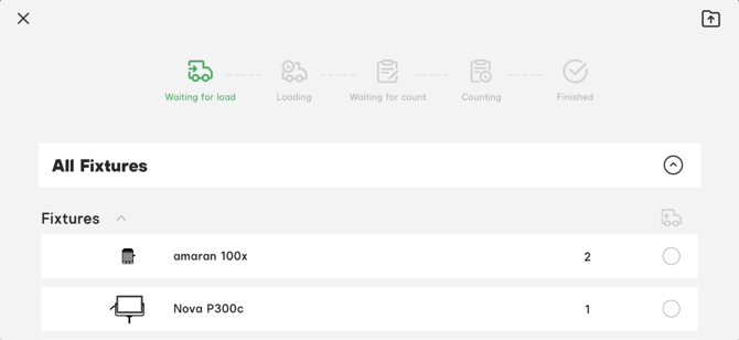
Figure 3.4.3.2 Load and Count
3.4.3.3 Export Wrap-Up List
-
Open a Wrap-up list and tap the export button in the
 top-right.
 -
Enter a file name, then tap Export to save the Wrap-up list as a PDF on your device..
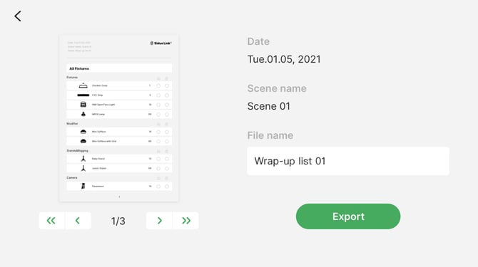 Figure 3.4.3.3 Export Wrap-up list
3.4.4 Full-screen mode
Tap the Full-screen button  at the bottom-left corner of the diagram to hide all of the editing buttons and enter Full-screen mode. You can still move and edit the icons in Full-screen mode.
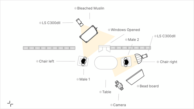
Figure 3.4.4 Full-screen Mode
3.5 Settings and Monitor
3.5.1 Settings
Tap the Settings button  to open the scene settings page. You can edit the elements in the current scene.
The Settings button displays as grey when there are no icons in the scene. The Settings options are:
- All: Items can show/hide marks, show/hide light beams and keep original size.
- Scene: Items can show/hide elements, show/hide marks and adjust the Alpha opacity.
- Property: Items can show/hide elements and adjust the Alpha opacity.
- Character: Items can show/hide elements, show/hide marks and adjust the Alpha opacity.
- Lighting: Items can show/hide elements, show/hide marks and adjust the Alpha opacity.
- Modifier: Items can show/hide elements, show/hide marks and adjust the Alpha opacity.
- Camera: Items can show/hide elements, show/hide marks and adjust the Alpha opacity.
- Background Image: Items can show/hide and adjust the Alpha opacity.
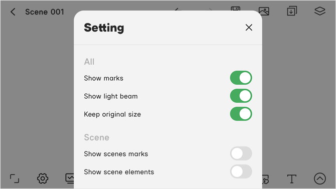 Figure 3.5.1 Settings
3.5.2 Monitor
- Tap the monitor button
 to view all of the icons in the scene as a list.
 - The monitor button
 displays as grey when there are no icons in the scene.
 - Select All to view all icon categories or select individual icon categories to view specific icon types.
- Select different tags to check different icons. Icons with an unselected tag or without a tag won't appear in the list. See details in 3.2 Icon Marking.
- You can select multiple categories and tags to filter icons.
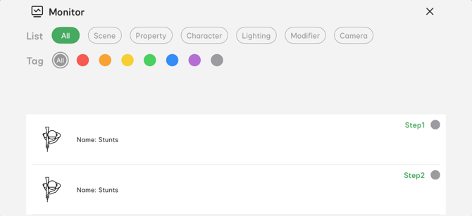
Figure 3.5.2 Monitor
3.6 Text
You can add text to the lighting diagram, adjust the text size and layout. The text button  is located in the bottom-right corner of the editing interface.
3.6.1 Add Text
-
Tap the text button
, then tap a blank area on the plot to add a text box. -
Type the applicable text, then tap the keyboard button on the bottom-right of the virtual keyboard.
3.6.2 Editing Text
- Select the text to edit the text size and color, or click the delete button to delete the text.
- You can choose a color from the color wheel and change the brightness with the slider.
- There are 12 preset colors, or you can delete or choose a custom color.
- Use the arrow on the text box to adjust the size of the text box.
- Tap and drag the text box to reposition it.
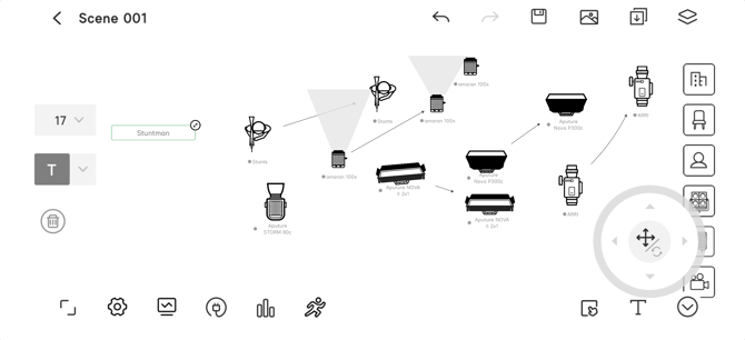
Figure 3.6.2 Text Function
3.7 Rehearsal
The rehearsal function is a powerful tool to display the movements of characters, cameras, props and other types of equipment for scene blocking.
Tap the rehearsal button  in the bottom-middle of the diagram.
You won't be able to access the rehearsal function when there aren't any multi-level motion path icons in the diagram.
3.7.1 Rehearsal Editing Buttons Instruction
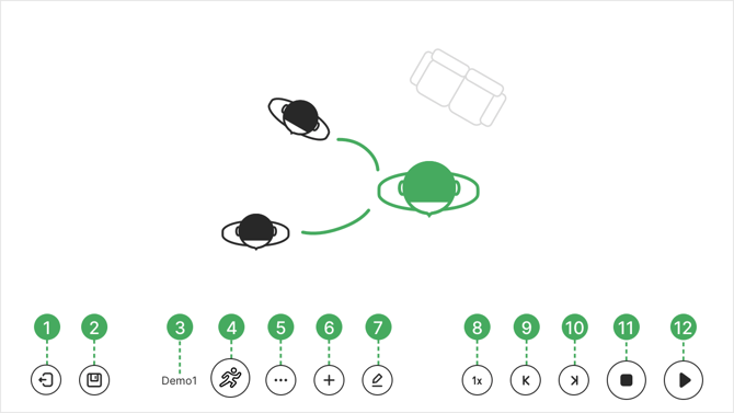
Figure 3.7.1 Rehearsal Editing Buttons
- Return to the scene editing page
- Save
- Current rehearsal name
- Rehearsal list
- Delete current rehearsal or edit current rehearsal info
- Create new rehearsal
- Edit current rehearsal
- Display speed control
- Previous motion
- Next motion
- Stop
- Play
3.7.2 Create a Rehearsal
- When entering the rehearsal editing page, all of the icons in the scene will display on the page. However, the editable icons are the icons that have multiple levels of motion path.
- Tap the create button
 , then enter the rehearsal name and interval time. Tap Confirm to create a new rehearsal.
 - The newly created rehearsal name will appear in the current rehearsal name display area.
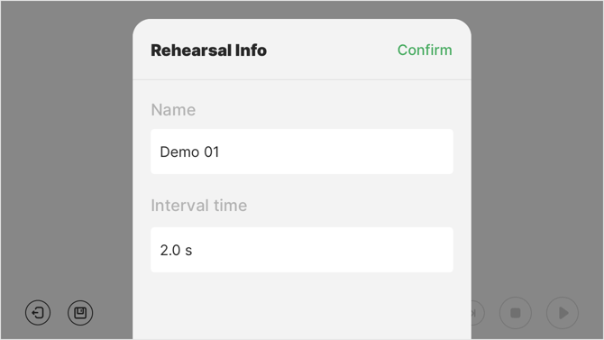 Figure 3.7.2 Rehearsal Info
3.7.3 Editing a Rehearsal
- Tap the editing button
 to show the rehearsal timeline.
 - The buttons on the up-right corner of the timeline are the reset timeline button
 , delete motion node button
  , interval time adjustment button
  , timeline adjustment button
  and create new motion node button
  .
. - Tap to select a motion node on the timeline, the node content window will appear on the left side of the page.
- Long-press the icon and move it to the node content window to add the icon to the motion node.
- You can add multiple icons to one motion node.
- Tap the interval time adjustment button to modify the interval time of two nodes.
- Tap the timeline adjustment button to adjust the scale of the timeline from 1 second, to 5 seconds to 30 seconds.
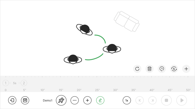 Figure 3.7.3 Rehearsal Timeline
3.7.4 Display the Rehearsal
- Tap the play button
 to play the rehearsal animation.
 - Tap the display speed control button
 to adjust the animation play speed from 0.5 times - 8 times.
 - Use the previous motion button
 and the next motion button
  to view the rehearsal motion node by node.
 - When playing the rehearsal animation, tap the stop button
 to stop playing.
 - Tap the play button to play the rehearsal animation.
3.7.5 Save and Apply Saved Rehearsal
- Tap the save button
 to save the rehearsal.
 - Tap the rehearsal list button
 to select and apply the saved rehearsal to the current editing page.
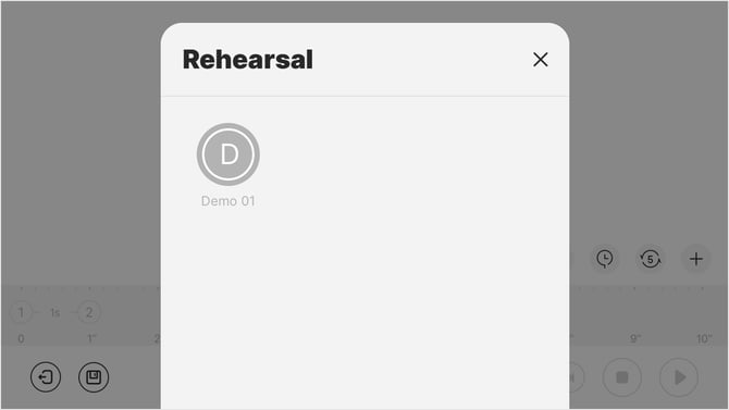 Figure 3.7.5 Rehearsal List
3.8 Insert Scene
The Insert scene button  and the scene management button
  are located at the upper-right corner of the editing interface.
3.8.1 Insert a Saved Lighting Diagram Scene
Tap the insert button to open a saved lighting diagram scene. Select a scene to insert to the current editing interface.
- Select a saved scene from the left side of the interface.
- Tap the scene, then click Confirm to insert the selected scene into the current scene.
- When selecting the scene, tap the preview button
 to preview the scene.
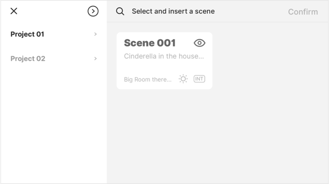 Figure 3.8.1 Insert a Scene
3.8.2 Scene Management
Tap the scene management button to enter the scene management menu. You can add, delete or edit the scene info in the management menu.
- Add a new scene: Tap the + button in the bottom-right corner to add a new scene. Fill in the scene information (name, location, time, and set) to create a new scene.
- Delete the scene: Select a scene then tap the
 button to delete. The deleted scene cannot be restored.
 - Scene Info: Select a scene then tap the
 button to enter the Scene info menu. You can edit the scene name, location, time and set.
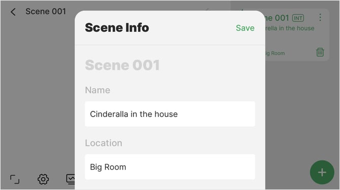 Figure 3.8.2 Scene Management Interface
3.9 Import Background Image
Tap the Background image button  to add a background image.
-
The imported image is displayed in the center of the diagram.
-
Only one background image can be added to a scene.
-
Tap Import from Photos, then select the image in Photos to set as the background image.
-
Tap Import from Files, then select an image file from the device as the background image.
-
Turn on the grayscale display switch to display the background image as a grayscale image.
-
Use the zoom function to adjust the size of the background image.
-
Tap
 to delete the background image from the diagram.
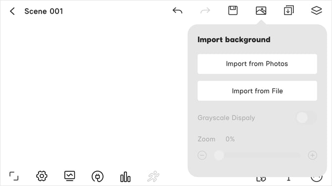 Fixture 3.9.1 Import Background Image
- The maximum size of an imported image is 5 MB.
- The background image will be compressed.
3.10 Undo/Redo, Save and Return
- The Undo and Redo buttons

 are located in the upper-right of the editing interface. Tapping the buttons will either undo or redo the last operation.
 - The Save button
 is located in the upper-right of the editing interface. Tap to save the current lighting diagram.
 - The Return button
 is located in the upper-left of the editing interface. Tap to return to the Script Roll page.
 - Save before returning to the Script Roll page. Unsaved operations will be lost.
4. CC Group
The CC group is used to share the lighting diagram with crew members. The powerful Sidus Cloud service allows you to update the collaborated project at any time with Internet access. You need to add the crew members to the CC group before sharing.
- On the Project page, select the CC group project then tap the button to view the collaborated/joined project and the CC group members.
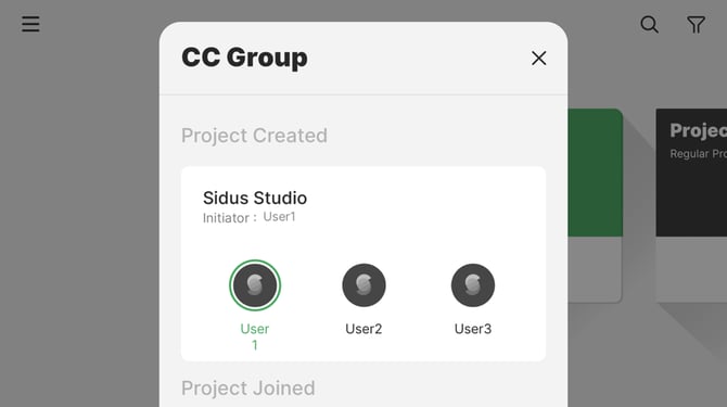 Figure 4 View CC Group Information
4.1 Share a Project with the CC Group
Open the Diagram master™ interface, select a project, then tap the button and turn on the collaboration button.
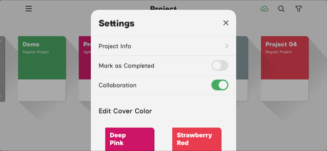
Figure 4.1 Project Setting Menu
4.2 View the CC Group Project
Open the Diagram Master™ workspace, tap the CC project to enter the CC group. The project types display on the top of the project as Project Created or Project Collaborated.
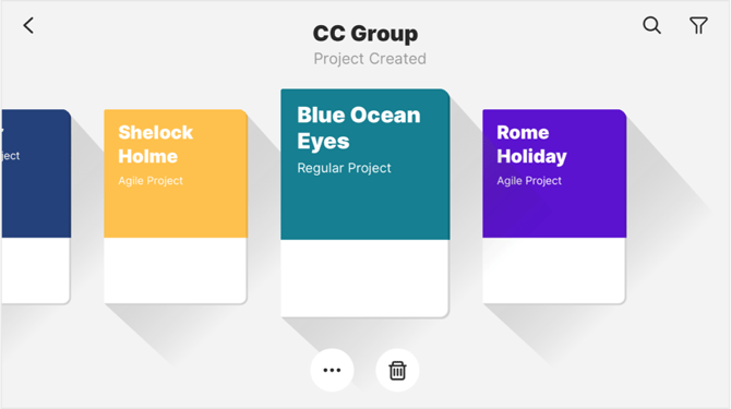 Figure 4.2-1 CC Group Projects
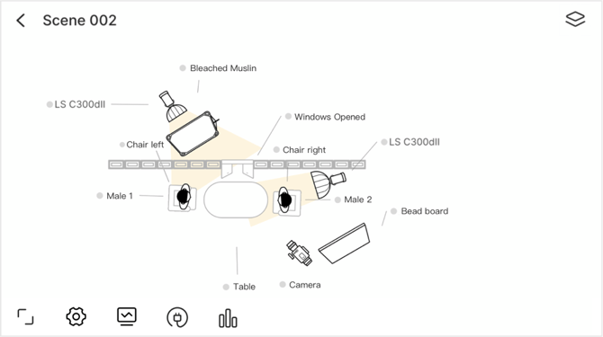 Figure 4.2-2 Joined Collaboration
4.3 Share the Project
Open the Diagram Master™ interface, select a project, then tap the button to manage the project.
- Project Info: Only the creator can edit the information of the created project. Added users in the collaboration can view the project, not edit it.
- Download to local: Users can download the lighting diagram and save it to their device.
- Mark as completed: "Finished" will display on the project.
- Collaboration: Users can share or cancel the collaboration in the management menu;
- Members. Check the members in this project.
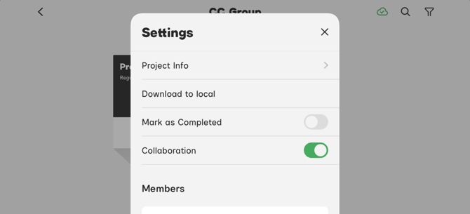
Figure 4.3 Share Project
4.4 Delete a Project
In the CC group interface, users can delete the project shared by themselves. Deleting the project will stop the project collaboration. Joined collaborators do not have permission to modify.
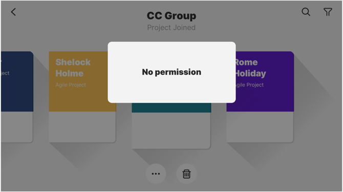 Figure 4.4 Users do not have permission to delete the joined collaboration